Context
At mio42, we develop MIOs ("Medical Information Objects"), which are national standards for structured datasets to enable the exchange of various medical data via the electronic health record in the future. These include topics such as medication plans, vaccination records, laboratory reports, doctors' letters, and much more. At their core, these are technical specifications that will later lead to uniform code files that can be exchanged between systems in an interoperable manner. Ultimately, the systems can and should decide for themselves how the datasets are displayed and how they are processed. Still, we wanted to create a shortcut for read-only systems (and a design template for the remaining): My task as a UX/UI designer has therefore been to develop a set of display components that can be integrated directly into the systems, thus making the respective dataset consumable in a uniform and visually optimized manner.
Process
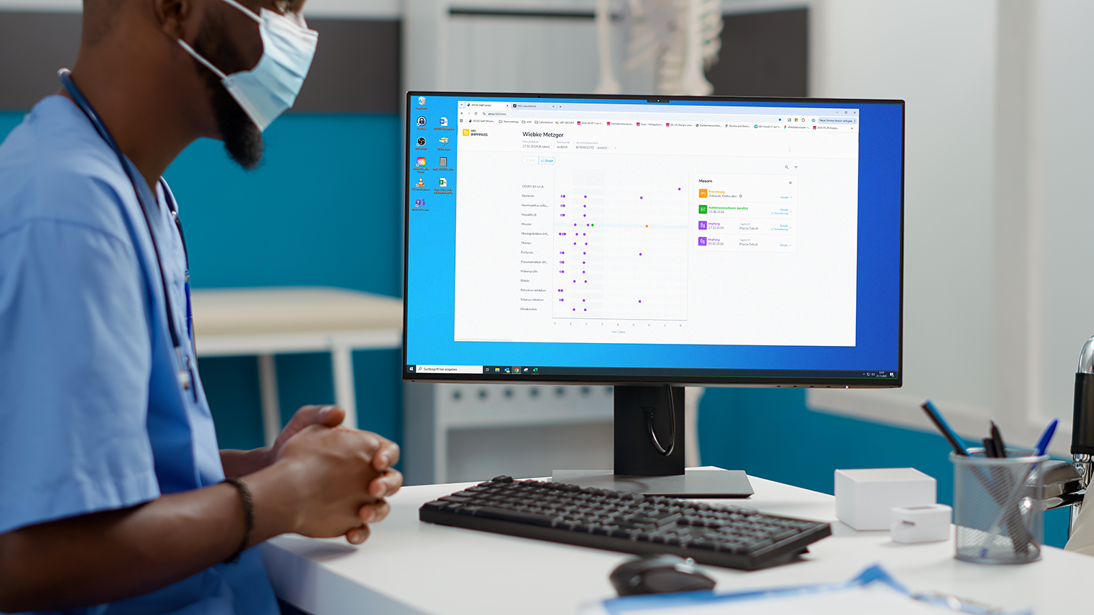
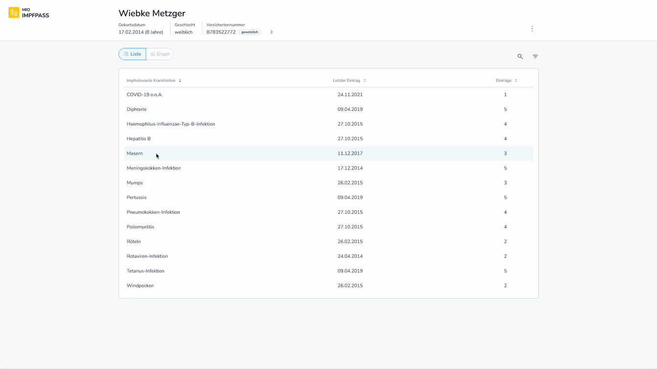
The first step was to understand the medical care processes, i.e., the touchpoints of the various care providers with the respective documents. Throughout this process, I have conducted in-depth discussions with multiple end users to gain a deeper understanding of their specific needs. For example, in the context of the vaccination record, I understood that this document is not only used to verify if all vaccinations have been completed but also to gain an idea of the patient's background and history (were all standard vaccinations carried out regularly during childhood or only later?). In an iterative process involving the end users, I hierarchized and organized the information, as well as designed, tested, and evaluated possible value-added functionalities (filtering, searching, graphical views). To ensure a consistent look and feel across all MIO projects, I established a design library, which I continuously expanded and iteratively refined throughout the different projects.
Main Challenges
- very large and complex data structures with a level of detail that has so far had no equivalent in existing solutions (PDF, Paper)
- in some cases, less obvious secondary use scenarios
- diverse reading habits of the users, determined by their medical department, their respective existing solutions or their place of living (east vs. west germany)
Key decisions
- individual display settings, eg. to switch on and off certain fields (from the first level)
- graphic modes, eg. to enhance quick reception of timelines
- optional quick-jump-navigation long lists of results
- quick-filters for the main use cases
- full-text search through the whole entry including the invisible fields
Reflection
Instead of trying to define one optimal structure, I learned that supporting multiple perspectives through adaptable interface patterns is more sustainable. This way, the design could accommodate different mental models. To presere a consistent visual language, the component library became a central tool: it evolved from a simple collection of components into a scalable system that supported new data structures without increasing design complexity.